Bass Connections 2020-2021
Deep Learning for Rare Energy Infrastructure in Satellite Imagery

Ada Ye, Eddy Lin, Jose Luis Moscoso, Tyler Feldman, Jessie Ou, Wendy Zhang

See Our Github Repository Dataset

Motivation


Energy Access Planning

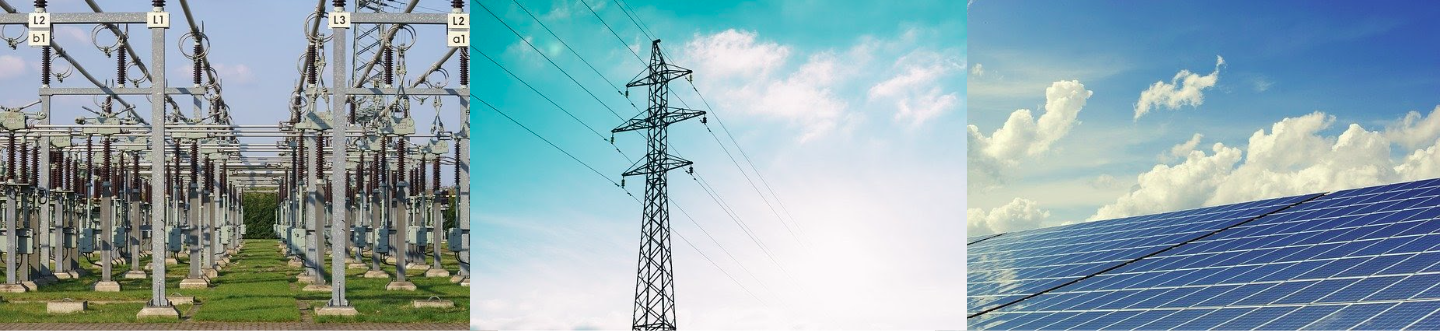
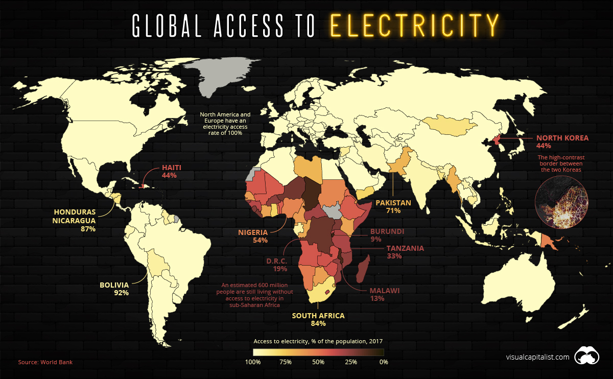
Access to electricity is correlated with improvements in income, education, maternal mortality, and gender equality. Around 1.2 billion people worldwide do not have electricity in their homes, many of them located in Subsaharan Africa and Asia. Information on the location and characteristics of energy infrastructure comprising generation, transmission, and end-use consumption can inform policy makers in energy access planning and is critical to efficiently deploying energy resources. Such information will allow energy developers to understand how best serve the electricity needs of communities without access to electricity through either power grid extensions, micro/mini grids, or off-grid solutions.

Image from: https://www.visualcapitalist.com/mapped-billion-people-without-access-to-electricity/

However, energy data for developers is often outdated, incomplete, or inaccessible. This is a common issue for NGO’s and other developers of distributed energy resources (DER) and microgrids who are looking to provide additional electricity access.

One potential solution to this lack of energy infrastructure data is to automate the process of mapping energy infrastructure using deep learning in satellite imagery. Using deep learning, we can feed an overhead image to a model and make predictions about the contents or characteristics of the region photographed in the image. Using this tool, the resulting information on energy infrastructure can then help inform energy access planning, such as deciding the most cost-effective option among distributed generation, micro-grids, or grid extension strategies for electrification.

Object Detection

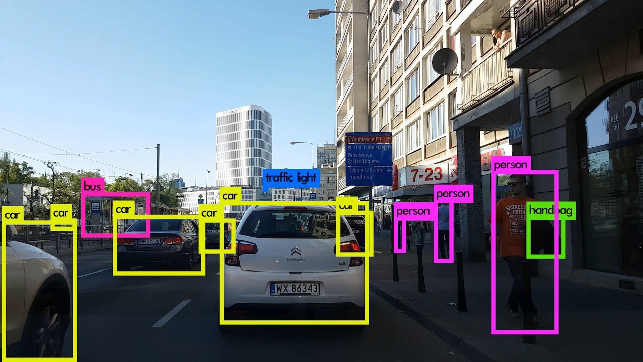
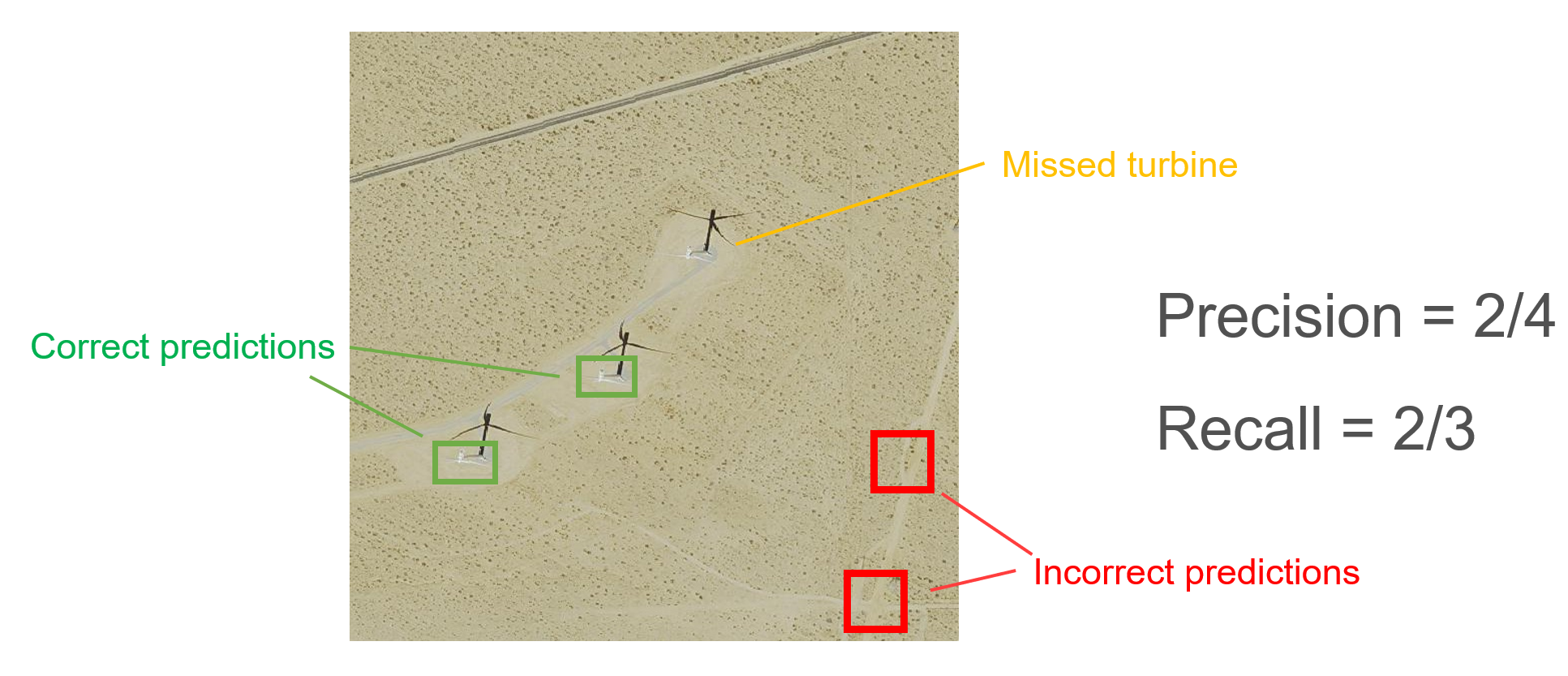
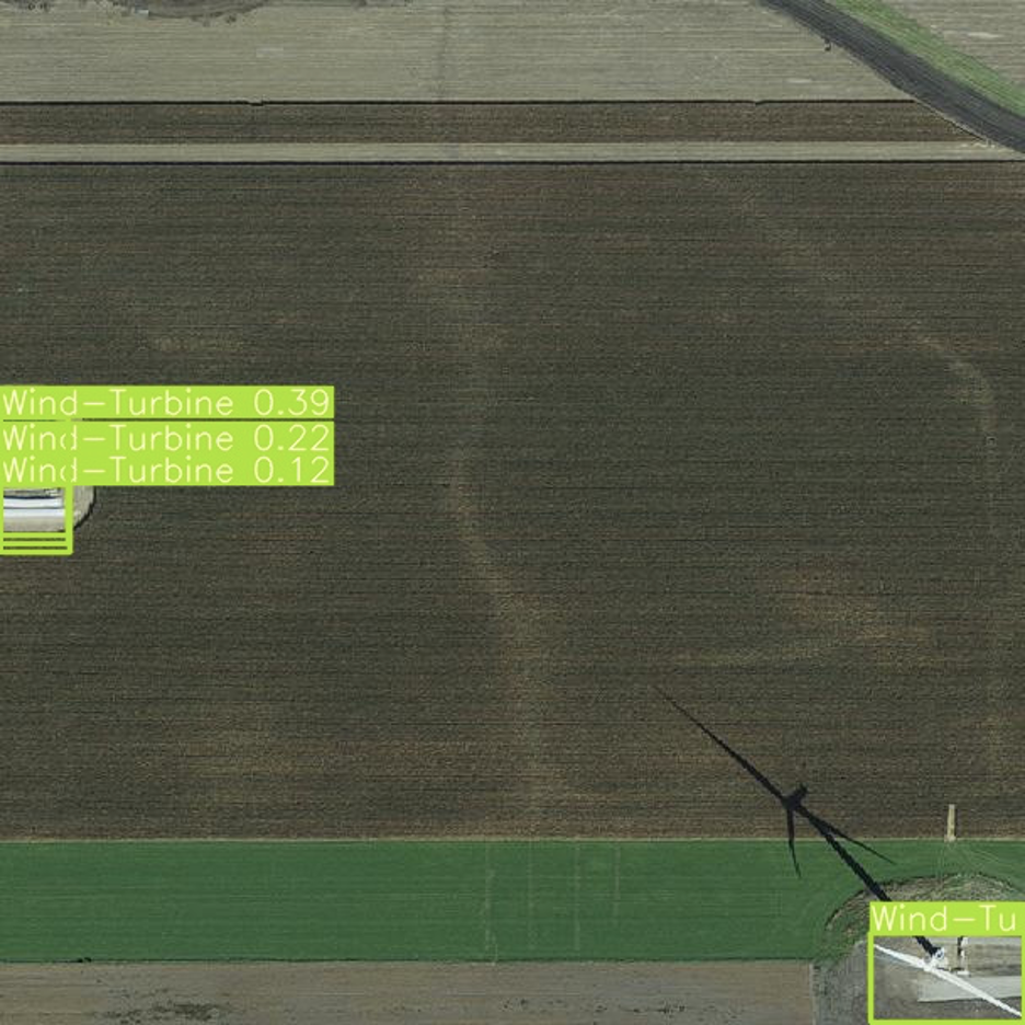
For this project, we focus on object detection, which is a combination of classification with object localization. The model analyzes images and predicts bounding boxes that surround each object within the image. It also classifies each object, producing a confidence score corresponding to the level of certainty of its prediction. In the image on the left, the model predicted that there were different objects represented by each of the boxes shown in green, yellow and pink. The model also predicted that the objects within these colored boxes were a handbag, a car, and a person respectively. The model learns how to predict these boxes and classifications based on examples shown to it. These examples have labels (the object’s class and the location of the bounding box within the image) that we collectively refer to as ground truth.

Applying Deep Learning to Overhead Imagery

apply deep learning

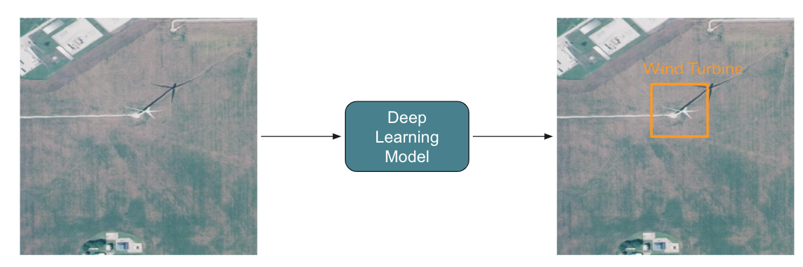
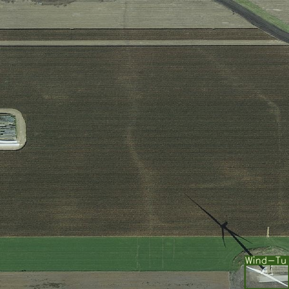
After training this model, we could apply it to a collection of overhead imagery to locate and classify energy 
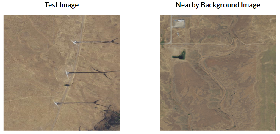
infrastructure across a whole region. While we could demonstrate this for any number of types of electricity 
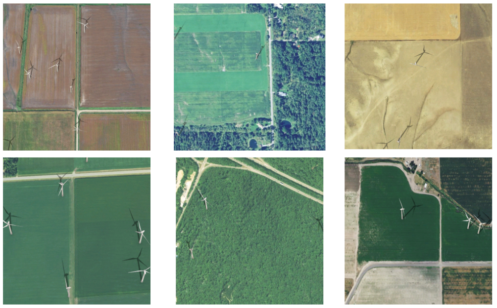
infrastructure, we use wind turbines because they are relatively homogeneous in appearance, unlike power plants, for example, which come in many different configurations. Outside of size differences, there is little variation 
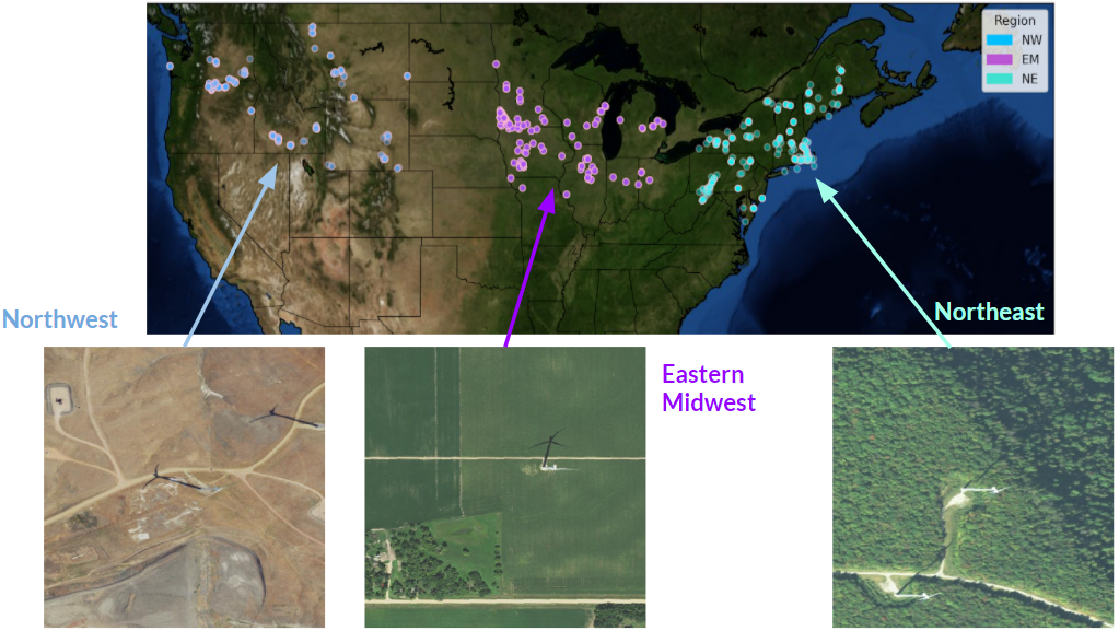
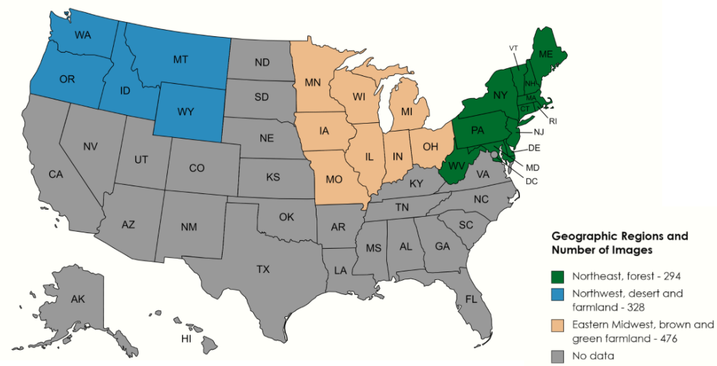
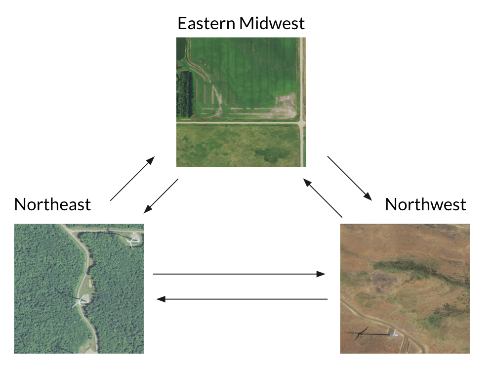
between types of wind turbines. We also start with data from within the US, because high resolution overhead imagery data are readily available across the continental US.

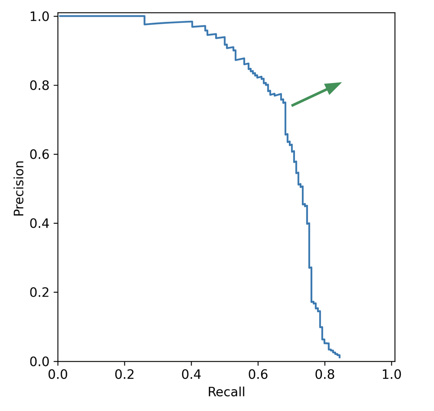
Challenges with Object Detection

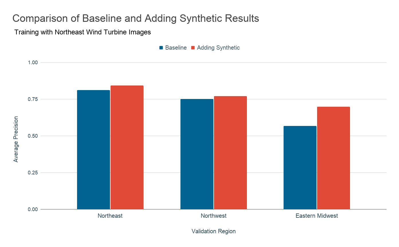
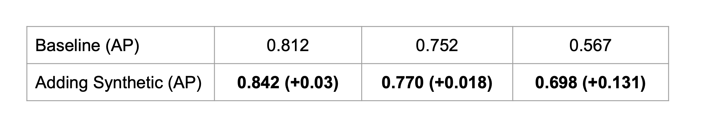
Problem 1: Lack of labeled data for rare objects

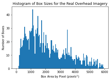
Object detection networks, like the one used in this work, are notorious for their "data hunger," requiring large amounts of annotated training data to perform well. For common infrastructure like buildings and roads, there is ample real-world data available to train such models. However, energy infrastructure is rare both in number and density, so collecting and annotating large amounts of satellite images manually is expensive and time consuming.

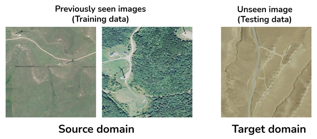
Problem 2: Domain adaptation

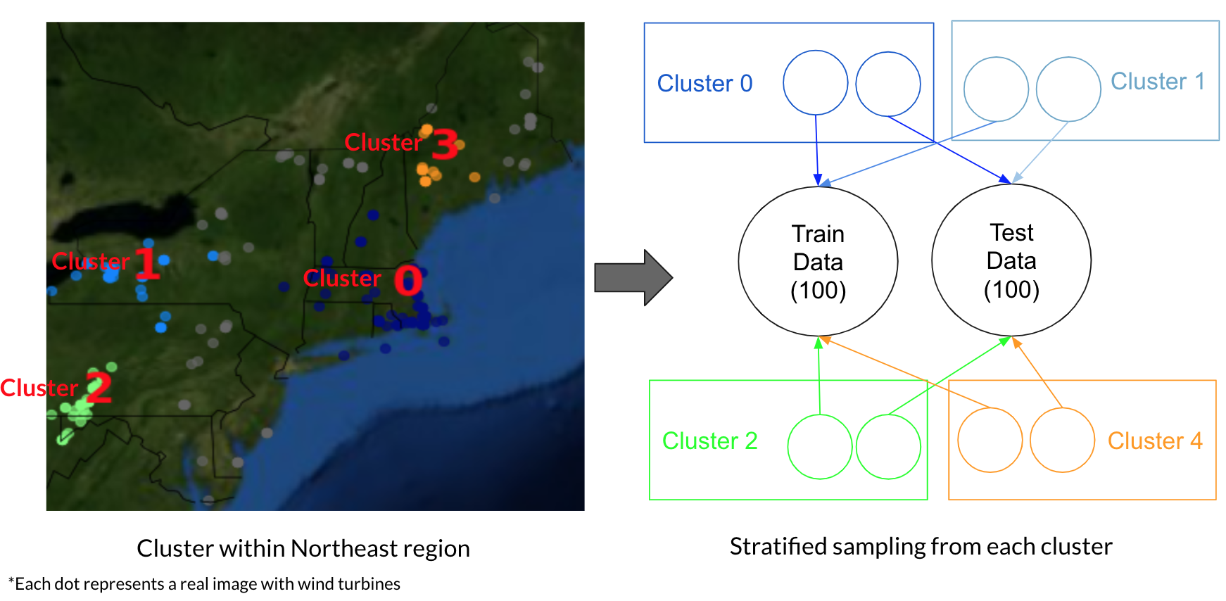
Typically our labeled training data are not from the same location as where we want to apply these techniques. However, object detection models poor performance on images that are from domians that are not similar to the ones that it has previously seen. In our case, this means the model will struggle when trying to apply it to new geographies and to different variations of styles of energy infrastructure.


Figure: Example of the domain adaptation challenge, for a model trained on images with geographical features of the images in the source domain (forest & grasslands) that underperforms when tested on images with different background in the target domain (desert)

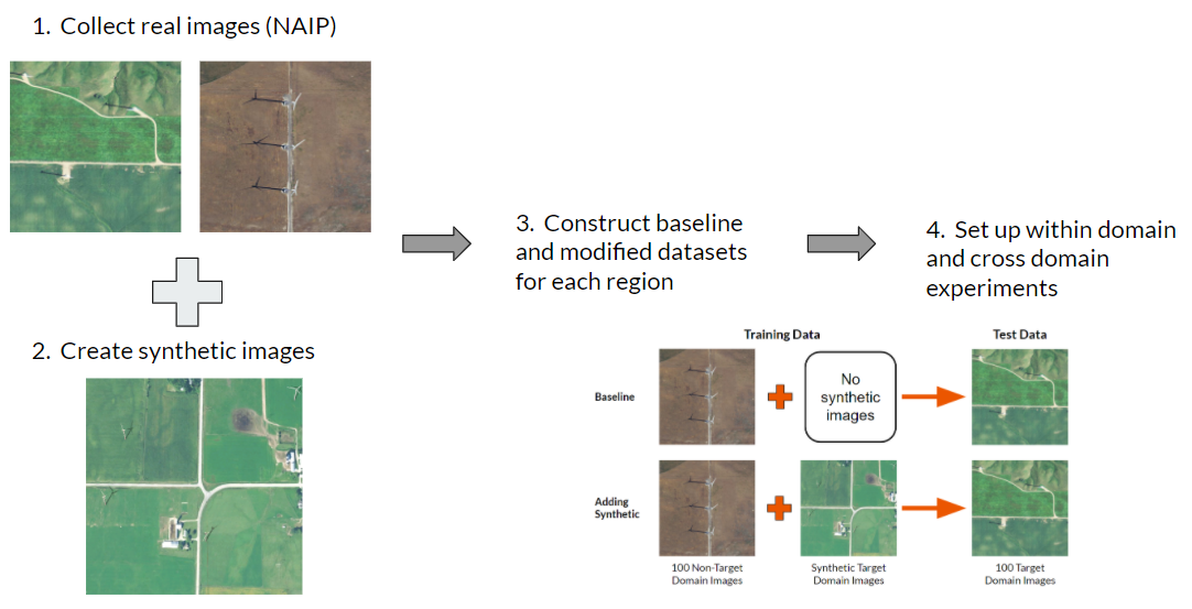
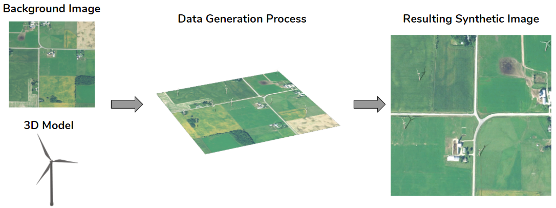
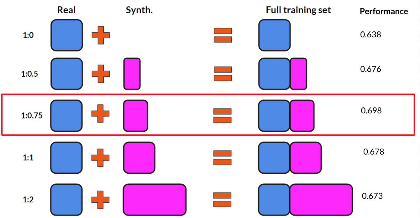
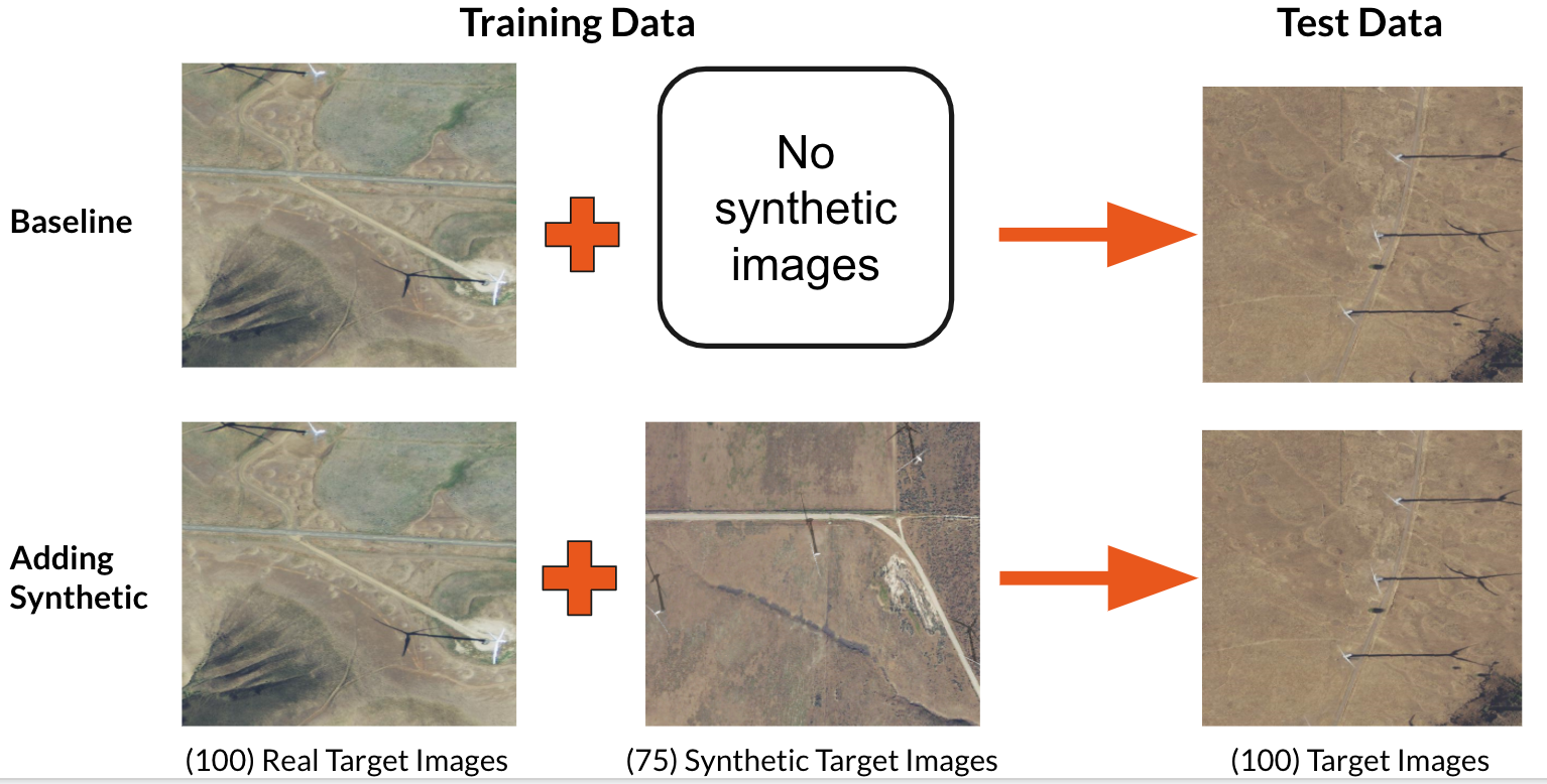
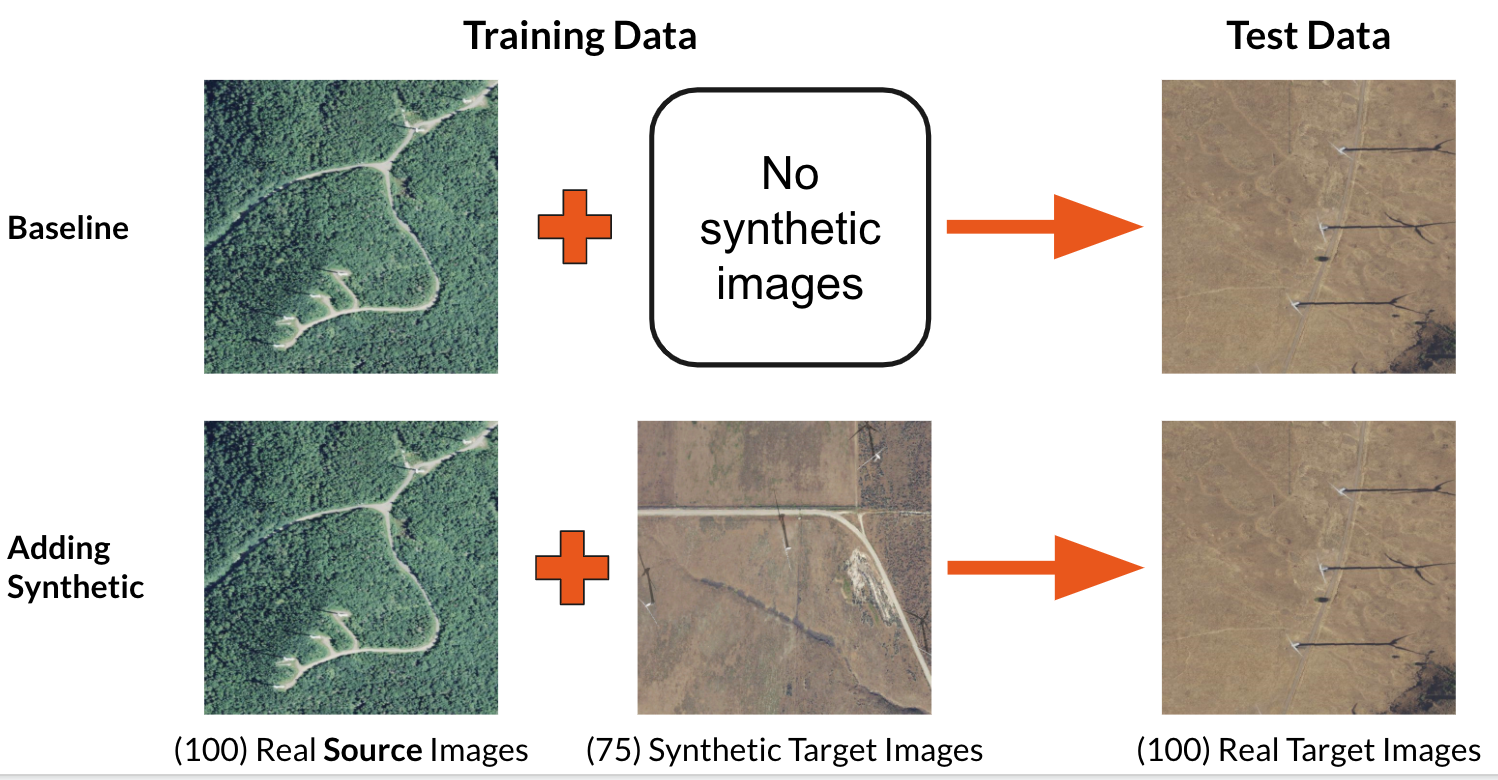
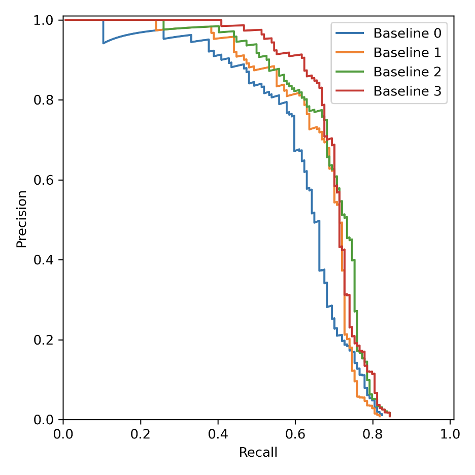
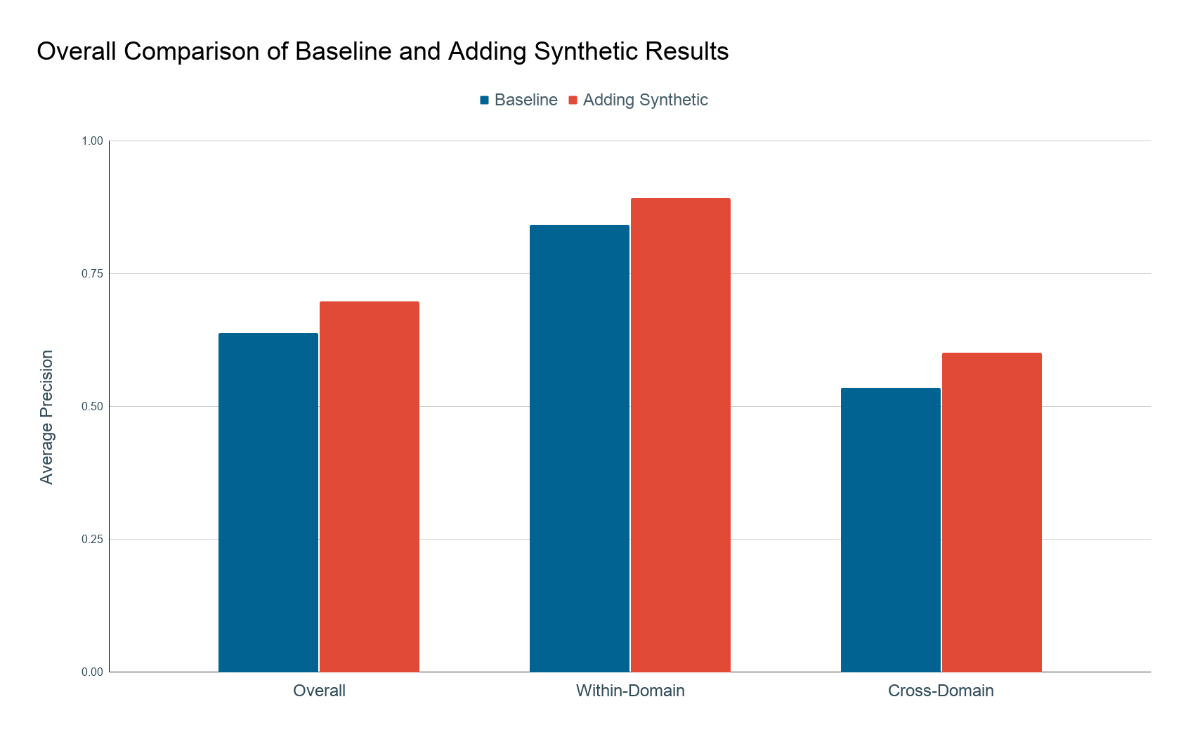
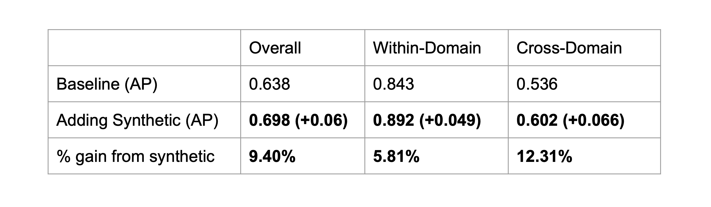
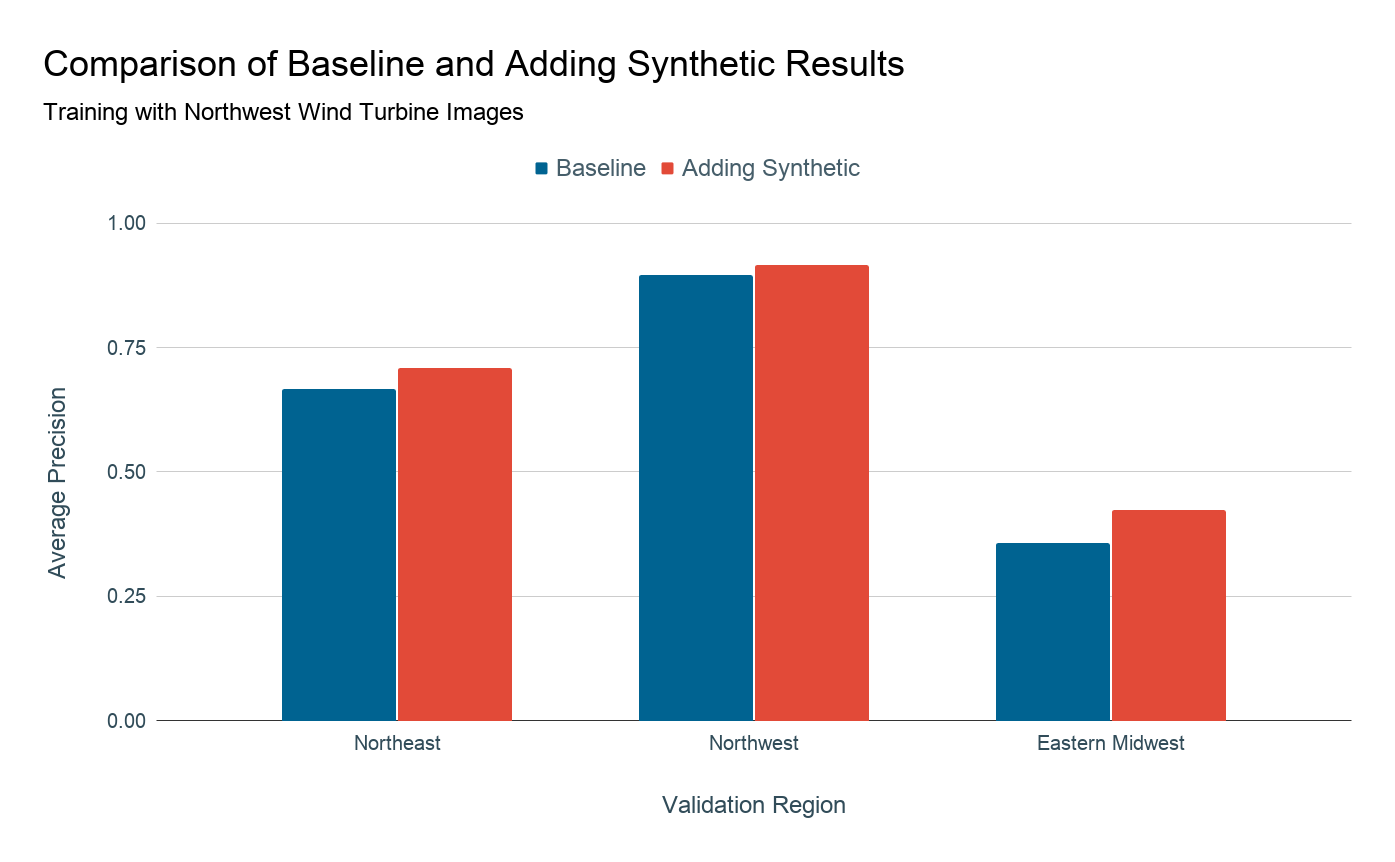
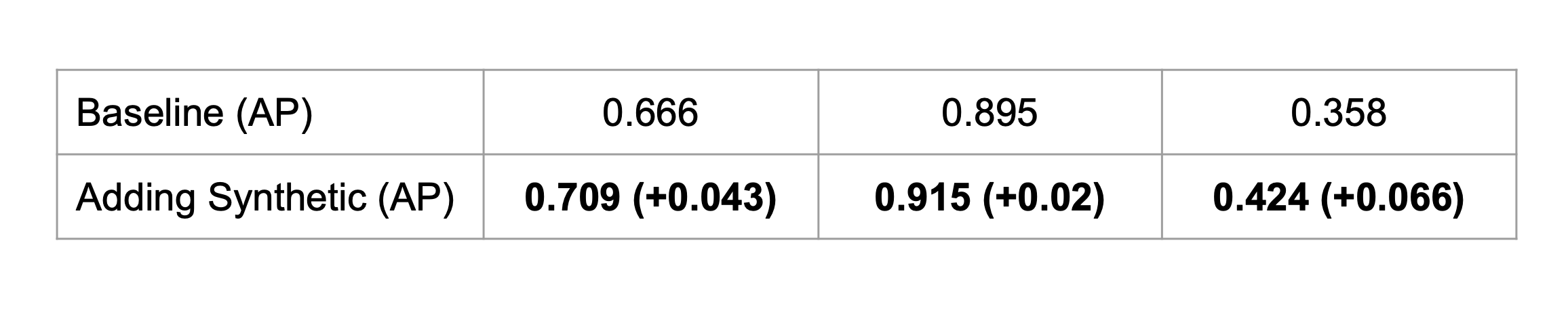
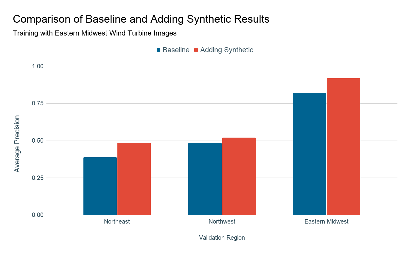
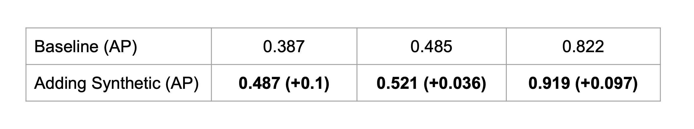
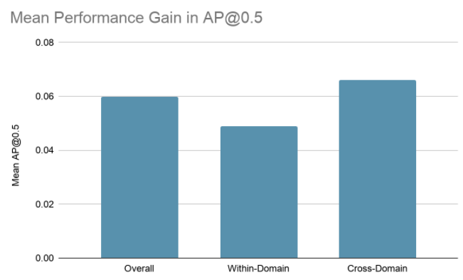
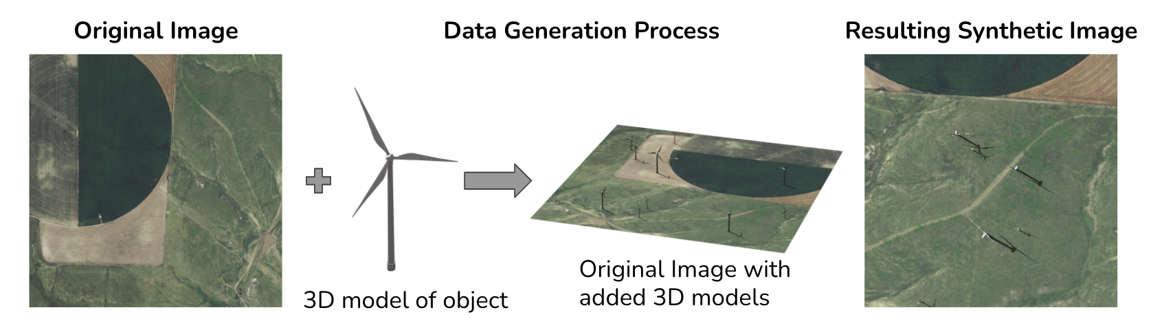
Proposed solution: synthetic imagery

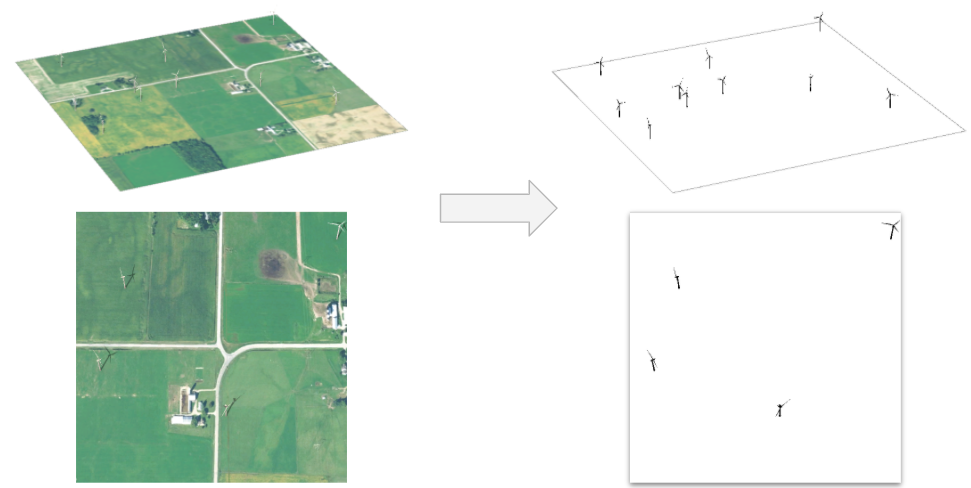
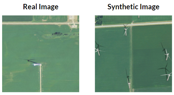
Since training data are difficult to collect, in this project we explore creating synthetic data to supplement the real data that are available. We do this by taking a real image without any energy infrastructure present and introducing a 3D model of an object of interest on top of that image as seen in the figure below. Then we position the camera in the overhead position and capture images in a manner that mimics the appearance of overhead imagery. Knowing where we placed the wind turbines in the synthetic image, we also generate ground truth labels for each of these images.


Figure: Synthetic imagery generation process overview

Previous work

For five years, the Duke Energy Data Analytics Lab has worked on developing deep learning models that identify energy infrastructure, with an end goal of generating maps of power systems and their characteristics that can aid policymakers in implementing effective electrification strategies. In 2015-16, researchers created a model that can detect solar photovoltaic arrays with high accuracy [2015-16 Bass Connections Team]. In 2018-19, this model was improved to identify different types of transmission and distribution energy infrastructures, including power lines and transmission towers [2018-19 Bass Connections Team]. Last year's project focused on increasing the adaptability of detection models across different geographies by creating realistic synthetic imagery [2019-20 Bass Connections Team]. In our project, we build upon this progress and try to improve the model's ability to detect rare objects in new, diverse locations.

Methodology


Below you can see a summary of the experiments we ran to explore whether adding synthetic imagery improves the performance of an object detection model across geographic domains. We first need to collect real and synthetic imagery, and then we can create two datasets. One dataset contains purely real imagery, while the second contains the same real imagery, but we add in some synthetic images. We can train an object detection model on the first dataset, test its performance, and then do the same with the second dataset, and finally compare the two performances. If the performance of the model is better when trained on the dataset that had added synthetic imagery, we can say that the synthetic imagery helps the performance of the model. In this section, we'll walk through each of the steps required to perform this experiment.


Collecting Real Imagery

For our overhead imagery of wind turbines, we chose to sample them from the National Agriculture Imagery Program. This imagery covers a large part of the US and is very high resolution, making it great for our experiments. We collected imagery in three different regions that we called Northwest, Northeast, and Eastern Midwest. We noticed differences in the visual appearance of the background in the images collected in these three regions:

Northwest
- Hue is mostly brown
- Mostly desert and grassland
Northeast
- Hue is very green
- Mostly forests
Eastern Midwest
- Hue is mostly green, some brown
- Primarily farmland

Figure: Each dot represents a single image that we collected.


Below we can see the regions splits by which states they include, as well as the number of images we collected for each region.


Figure: Map of the U.S. showing the U.S. states and number of images we collected in each region

Creating Synthetic Imagery

To create synthetic imagery, we use a software called CityEngine. As inputs to this process, we need a list of background images that do not contain any wind turbines and a 3D model of a wind turbine. We then can automatically generate synthetic images. First, the software places a randomly chosen background image and then randomly generates 3D wind turbine models on top of the background image to create the 3D scene shown in the middle of the figure below. Next, the software moves a simulated camera in the overhead/bird's eye view and saves these overhead images.


We can repeat this process but remove the background images, and color in the turbine models as black to retrieve information on where the turbine models are located. The black pixels in these images can be automatically grouped together to locate the wind turbines and create a formatted label that contains the bounding box around each turbine model.

Figure: Side-by-side of an RGB image with its corresponding black-and-white label.


These synthetic images are simple, cheap, and fast to create. All we need are images for the background, and unlabeled imagery is far easier to acquire than labeled imagery. The rest of the process of generating the images and the labels is done automatically, making this a great alternative when we do not have enough real imagery or when it is time-consuming or expensive to collect. Below are some example synthetic images created from a variety of background images.


Figure: Our synthetic images contain a variety of background images and camera angles. They look fairly similar to our real imagery.


Synthetic Imagery Design Considerations

The design of the synthetic imagery is important because the closer the synthetic imagery is to the real imagery, the more the synthetic imagery will improve our performance when adding it to our training set.


Figure: Bounding box size distribution of turbines in real imagery.
Size of the Synthetic Turbines

The first consideration we have to make is what size to make the synthetic turbines. For this issue, we chose to model the size distribution of the synthetic turbines after the size distribution of the real turbines. We created a histogram of the size of the turbines in our real imagery, and modeled this in our synthetic imagery with multiple bins of uniform distributions.


Angle of the Camera

The next decision we had to make about the synthetic imagery design was the angle of the simulated camera when we are capturing photos. We noticed that in the real imagery, some of the images were captured at an angle. In the real overhead imagery, you can see the pole of the turbine due to the angle of the camera. We observed that about half of the real images were taken from directly above (90 degrees), and the rest were taken at a variety of angles that were between 60-90 degrees. In our synthetic image generation process, we chose half of the time to take the image from directly above. The other half of the time, we would use a randomly chosen camera angle between 60 and 90 degrees.

Figure: Bounding box size distribution of turbines in real imagery.

Figure: Test image and nearby collected background image.
Which Background Images to Use

We also have to choose which background images to have placed under our synthetic wind turbine models. We chose to collect background imagery close to the real images in our testing set so that our synthetic imagery would look as close as possible to the target data. We may likely be able to collect unlabelled imagery from around the region we wish to test on for use as background images. Using the background images close to our testing locations allows us to estimate the potential performance increase that the synthetic data can provide without adding in confounding variables such as a mismatch between the synthetic background image domain and the target domain.


Constructing the Datasets

Clustering and Stratified Sampling

Because our self-defined geographic regions are wide and diverse, it's important for our training and testing datasets to be representative of a given geographic region. To increase homogeneity within a region (we define a region as a "domain"), we clustered within each region and then performed stratified sampling from each cluster with proportional allocation to construct our 1:1 train:validation ratio (1 training image for each validation image) constrained baseline datasets, including 100 images total across the clusters within each domain. Each point represents an image, and each color represents a cluster. Points that are in the same cluster are more similar to each other than points that are in different clusters.


Figure: DBSCAN clustering within each geographic region and then stratified random sampling from each cluster to construct our training and testing datasets. Each dot represents a real imge, and each color represents a different cluster. For each cluster, the sample size is proportional to the cluster size, so larger clusters will have more images in both training and testing data.
Optimizing the Ratio of Real to Synthetic Data
Ratio Test Experimental Design

To construct our baseline and add synthetic data, we need to figure out what ratio of real to synthetic data yields the largest gain in performance (if any). If we add too much synthetic data, then we run the risk of overfitting to synthetic data. If we add too little synthetic data, then it will have little impact on performance. To find this ratio, we designed an experiment, where we test ratios of 1:0, 1:0.5, 1:0.75, 1:1, and 1:2 real to synthetic ratios. After conducting these experiments, we found that 1:0.75 yields the greatest performance as measured by average precision. Therefore, we design our experiments using the 1:0.75 ratio.


Experimental Setup


Having clustered and sampled our data and found the optimal real to synthetic ratio, our final datasets for each region is:

  • Baseline: Train on 100 Real Non-Target Images, Test on 100 Target Domain Images
  • Modified: Train on 100 Real Non-Target Images + 75 Syn Target Images, Test on 100 Target Domain Images

Overview

In the context of our work, we define a domain as a geographic region, such as the US Pacific Northwest. A target domain is where we aim to apply our model to, whereas a source domain is where the real training data comes from. The long-term goal of our project is to apply our object detection model to a variety of unseen domains around the world, especially in developing areas where information on energy infrastructure is hard to obtain. This requires our model to be able to generalizable, that is, the ability to perform well on images that are different from the images it was trained on. One real-world application in energy access planning is a scenario where there is limited labeled real data in target locations where we want to deploy energy resources to. For this scenario, we design within-domain experiments, where the target domain remains the same geographic region as source domain. A second and more challenging scenario is when there is no real data in the target locations where we want to deploy energy resources to. Because the target domain has no real data, we have to draw data from an alternative source domain. For this scenario, we design cross-domain experiments, where we train on a source domain but we test on a target domain.


Figure: Overall Experiment Setup. In within-domain experiments, the target domain (Northwest) remains the same geographic region as the source domain (Northwest). In cross-domain experiments, the target domain (Northeast) has no labeled real data, so the model is trained on a different source domain (Northwest) and then applied to the target domain. Orange color denotes a source domain, whereas blue color denotes a target domain.
Pairwise Experiment Setup Figure: Pairwise experiment setup. The arrow tails point toward the source domain (where real training data comes from), whereas the arrow heads point toward the target domain (where the model will be tested on). Bi-directional arrows indicate each domain serves as the source for testing the other two domains, and in a separate experiment, the same domain serves as the target to be tested using model trained on the other domains.

Our hypothesis is that synthetic imagery will help our model generalize to unseen domain - the model performance will improve when testing on a new geography in the presence of synthetic data. We assume that training and testing on separate data, but from within the same domain, will perform better in general than training and testing on separate data from different domains. Note that although examples from continental US is shown here, in reality, a target domain is likely a less developed area without reliable access to electricity, and a source domain is likely a developed area with readily available data on energy infrastructures.

In our case, each domain is a geographic region that we defined. Namely, Northwest, Northeast, and Eastern Midwest. To test the impact of each region, we run a 3-way pairwise experiment, where we train and test on each of the 3 regions, resulting in 6 experiments. For example, the Northeast region serves as the source domain for testing Northwest and Eastern Midwest. Then in a different experiment, a model trained using Eastern Midwest is tested on Northeast, and in another experiment, a model trained on Northwest is tested on Northeast.


Figure: Within-domain experiment example using Northwest as target domain.
Within Domain Experiment (Target = Source)

Before we test how well synthetic imagery improves performance when the model is testing on a different domain than the one it was trained on, we need to establish some baseline performance results for detecting wind turbines in the imagery to evaluate whether adding synthetic imagery improves our model's accuracy. We need to know how well the model is doing when it is trained and tested on the same domain. Using Northwest region as our target domain, we ran our baseline and modified experiments, and we repeat for the other domains/regions.


Figure: Cross-domain experiment example using Northwest as target domain and Eastern Midwest as non-target domain.
Cross Domain Experiment (Target not equal to Source)

These experiments are designed to test if synthetic data can help overcome differences in geography. To test whether adding synthetic imagery improves our model's generalizability, we trained on one region, and tested on another region (cross-domain). Then we added synthetic imagery similar to the target domain and compared performance against the baseline. Augmenting our baseline dataset with synthetic data not only provides more exmaples of images with wind turbines, but it provides examples that are more similar to the target locations the model will be deployed to. Thus, we expect adding synthetic data to improve our model's generalizability. Here we demonstrate this experiment setup using Northwest as the target domain and Eastern Midwest as the non-target domain. We repeated for the other domains as well.


Results


Figure 1: The model predicted that 4 objects were wind turbines. 2 of those predictions were correct, meaning the precision would be 2/4. There are 3 wind turbines in the image and the model found 2 of these, meaning the recall would be 2/3.

Performance Metrics

To understand our results, it's important that we first understand the metrics that we have chosen to measure performance. The primary metrics we will use is Average Precision. We will explain the implication of this metric starting with the images on the left.

  • Precision: Out of the objects that the model classified as a wind turbine, what fraction of these were actually wind turbines.
  • Recall: Out of wind turbines present in the data, what fraction of these did the model find.

Now we plot the values of precision and recall a model can reach when doing predictions on a graph, which is known as a precision-recall curve. You can see on the curve that as precision increases, recall decreases, and vice versa. There is hence a tradeoff between precision and recall. However, we would like to have high values for both precision and recall, which means we would like the area under the precision-recall curve to be as high as possible. A metric that quantifies this area is Average Precision (AP).

Note that in the machine learning space, a small absolute increase in AP is already a significant improvement.


Figure 2: Sample Precision Recall Curve. We would like the curve to move to right as much as possible as indicated by the green arrow.


Figure 3: Sample PR curves of 4 runs of the same experiment.

Reducing Variance

Due to variability in the object detection model’s training process, there will be variations between the results of each run, as shown on the left image. Each experiment is therefore repeated 4 times to account for this randomness and improve the accuracy of the result. The average AP value is calculated and used to compare results of our baseline model and model with added synthetic images.


Results

The performances of the model with added synthetic images improve significantly in both within-domain and cross-domain settings. Synthetic images are especially helpful in cross-domain settings, which means they can be useful when there is a lack of data or when it is cost-prohibitive to collect data of the target domain.


Figure 4: All values are in average precision (AP).


Figure 5: Sample test image from the baseline experiment of training on Northeast and testing on Eastern Midwest. The model falsely predicted an architecture to the right as 3 wind turbines.

Figure 6: Sample test image from the adding synthetic experiment of training on Northeast and testing on Eastern Midwest. The adding synthetic prediction is able to achieve a higher precision.


Results of Each Geographic Domain Respectively

Here we will present a closer look into the results of training with real images from each of the 3 geographic regions respectively. There is a disparity in performance when the model is trained with real images of different geographic domains. In particular, in cross-domain experiments that test on Eastern Midwest, the model performs generally worse than when testing on other regions.


Figure 7: Results of training with real images from Northeast.


Figure 8: Results of training with real images from Northwest.


Figure 9: Results of training with real images from Eastern Midwest

As shown on the left and above, the model performs consistently worse when testing on Eastern Midwest, yet Eastern Midwest is also the region where the model has the greatest average improvement in average precision from the addition of synthetic imagery. The exact model performance and improvement synthetic images can make hence depend on the details of specific geographic regions.

It is therefore possibly more challenging for the model to perform well in certain settings, such as when there are different designs of wind turbines in a region or when the region has more diverse geographic backgrounds. Despite these challenges, synthetic imagery was able to help bridge the gap and bring significant improvement to model performance.

Key Takeaways


The results show that adding the curated synthetic imagery improves the performance of our object detection model in all cases. This is especially the case when we have a cross domain setting (testing on an unseen region). The performance increase is more limited in the within domain setting, where there the model is testing on a previously seen region. We also explored the various ratios of real to synthetic imagery and found an optimal ratio. This method of synthetic generation is cheap and fast to produce, allowing us to help an object detection model perform on new domains or when we lack training data, which is often the case when we are trying to obtain information on energy infrastructure. With the aid of synthetic imagery, this method of collecting locations of energy infrastructure could fill in the information gaps that energy access planners need when making decisions about electrification.


Future Work


  1. Apply these techniques to detect other types of energy infrastructure. Because high voltage transmission towers are similar structure to wind turbines, we can easily adapt our synthetic image generation process for transmission towers. We could then test this synthetic imagery in the same manner as what we performed for the synthetic imagery of wind turbines, and see if this method extends to this other types of energy infrastructure.


  2. Images from Pixabay: Substation, Transmission Tower, Solar Panels

  3. Investigate few shot learning, where we use small amounts of real images and large amounts of synthetic data to adapt our object detection model to any region that we choose.


  4. Figure: Guo, Y., Codella, N., Karlinsky, L., Smith, J., Simunic, T., & Feris, R. (2019). A New Benchmark for Evaluation of Cross-Domain Few-Shot Learning. ArXiv, abs/1912.07200.

  5. We would also like to explore more methods of generating synthetic data. One method in particular would be using generative adversarial networks (GANs) to generate synthetic imagery with deep learning. This could look more realistic than the current synthetic imagery, since the synthetic image generation process would learn from the real imagery we have. This could enable incorporating the context of the energy infrastructure more accurately. For example, in our current image generation strategy, we place the wind turbines randomly within the image. This could be on top of a forest or in a car park rather than where we typically find them: in a clearing with an access road nearby.

Acknowledgements


We would like to thank Dr. Kyle Bradbury, Dr. Jordan Malof, and Wayne Hu for their help and guidance along the way. We would also like to thank the previous Bass Connections and Data+ teams for their work leading up to this project. We would also like to thank Dr. Rob Fetter, Dr. Marc Jeuland, and Dr. Luana Lima for sharing their work with us. Thank you to the Duke Bass Connections Program and Duke Energy Initiative that supported this project.